
Ecommerce
Mobile-Friendly Shopify Store Design: Why It Matters for Ecommerce Growth
Learn why mobile-friendly Shopify design drives conversions, SEO, and repeat sales, and how a Shopify development team in Calgary can help your store grow.
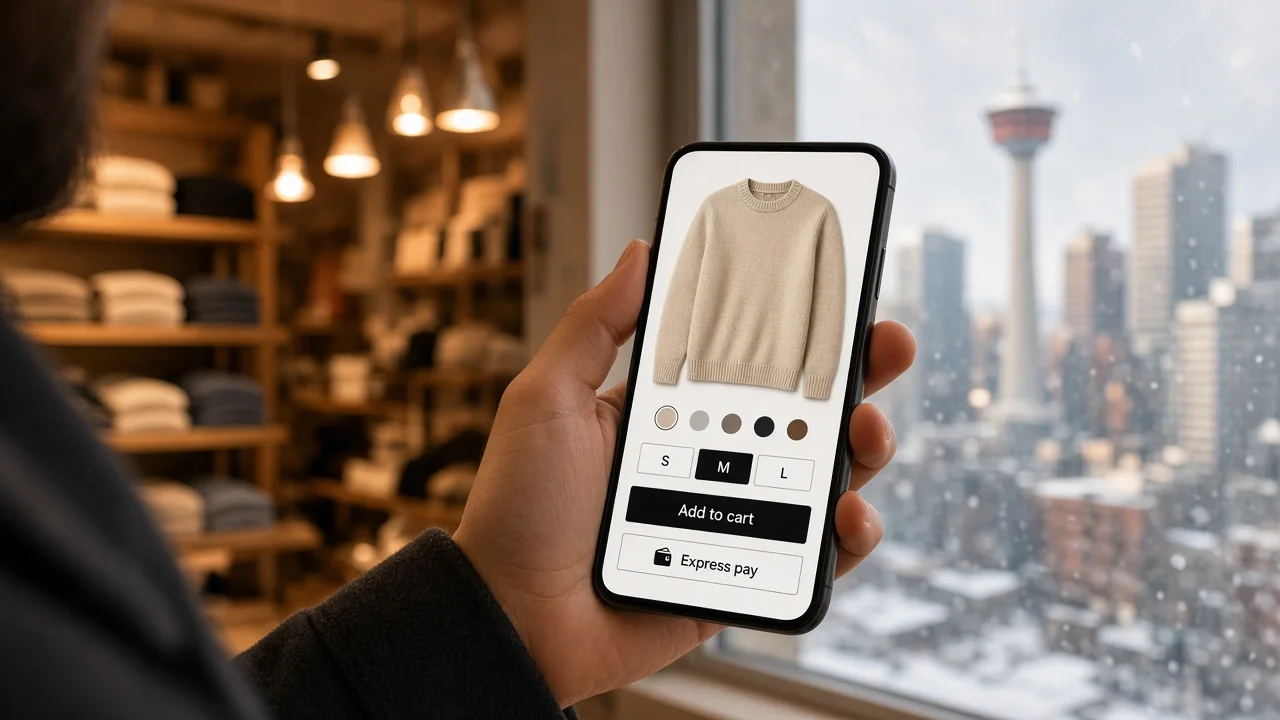
Think about the last time you bought something online. Chances are you were on your couch, in a queue, or on a bus, holding your phone in one hand. Your customers shop the same way. Today, most ecommerce traffic comes from mobile devices, and shoppers decide within seconds whether a store feels easy or frustrating.
If your Shopify store looks great on a desktop but feels clunky on a phone, you are not just losing a few clicks. You are losing sales, trust, and search visibility. At x360 Digital, our Shopify development work in Calgary has shown us the same pattern again and again: brands that treat mobile as the main experience, not an afterthought, grow faster.
Here is why mobile-friendly Shopify design matters, and what it takes to get it right.
Mobile shoppers are your main shoppers
A few years ago, “mobile-friendly” meant making sure your site did not break on a small screen. That bar is far too low now. Shoppers expect fast pages, thumb-friendly menus, clear product images, and a checkout that takes seconds, not minutes.
For many Calgary retailers, from outdoor gear shops to local food brands and fashion labels, mobile visitors make up the majority of sessions. Yet mobile conversion rates often lag behind desktop. That gap is not because people do not want to buy on their phones. It is usually because the experience gets in their way.
Closing that gap is one of the biggest growth opportunities in ecommerce.
How mobile design affects your revenue
1. Faster pages mean more sales
Mobile users are impatient, and for good reason. Slow pages feel unreliable. Large uncompressed images, heavy apps, and bloated scripts are common culprits on Shopify stores. A mobile-first build keeps pages light, loads key content first, and removes anything that does not earn its place.
Even small speed improvements can reduce bounce rates and keep shoppers browsing longer, which gives you more chances to convert them.
2. Easy navigation keeps people moving
On a small screen, every extra tap costs you. A good mobile Shopify design uses simple menus, visible search, sticky add-to-cart buttons, and clear collection filters. Shoppers should find what they want in two or three taps, without pinching, zooming, or guessing.
3. A smoother checkout reduces abandoned carts
Cart abandonment is a persistent problem in ecommerce, and mobile checkout friction is a big reason. Tiny form fields, forced account creation, and slow-loading payment steps all push buyers away. Shopify’s checkout is already strong, but your theme, cart drawer, and upsell tools need to work with it, not against it. Options like Shop Pay, Apple Pay, and Google Pay can cut the effort of paying to a single tap.
4. Trust is built in the details
People judge a store within moments. Readable text, properly sized buttons, crisp product photos, visible shipping information, and clear return policies all signal that a real, reliable business is behind the screen. On mobile, there is no room to hide sloppy design. Every detail is on display.
Mobile-friendly design and SEO
Google uses mobile-first indexing, which means it primarily looks at the mobile version of your site to decide how you rank. If your mobile pages are slow, cluttered, or missing content that appears on desktop, your visibility can suffer.
A mobile-friendly Shopify store supports SEO in several ways:
- Better Core Web Vitals: Fast loading, stable layouts, and responsive interactions are part of how Google measures page experience.
- Lower bounce rates: When visitors stay and engage, it sends a positive signal about your content.
- Cleaner structure: A well-built mobile layout makes it easier for search engines to understand your products, collections, and content.
For local businesses, this matters even more. Many “near me” searches happen on phones. If someone in Calgary searches for a product you sell, a fast, mobile-friendly store gives you a real edge over slower competitors.
What good mobile Shopify design looks like
After years of building and refining online stores, here is what we focus on when designing for mobile:
Start with mobile, then scale up. Design the phone experience first. It forces clear priorities. If something does not fit on a small screen, ask whether it is truly needed.
Use thumb-friendly layouts. Place key actions, like Add to Cart and Checkout, within easy reach. Buttons should be large enough to tap without accidents.
Optimize images and media. Use modern formats, proper compression, and lazy loading. Product images should look sharp without slowing the page down.
Keep product pages focused. Lead with a strong image, price, a short benefit-driven description, and a clear call to action. Put longer details in expandable sections so the page stays easy to scan.
Audit your apps. Every Shopify app adds code. We regularly find stores running apps they no longer use, which quietly drag down speed. Fewer, better-chosen apps almost always perform better.
Test on real devices. Browser previews are useful, but nothing replaces testing on actual phones across different screen sizes, browsers, and connection speeds.
Why local expertise makes a difference
Choosing a Shopify development partner in Calgary means working with people who understand your market. Local shoppers have specific expectations around shipping times, Canadian pricing and taxes, bilingual needs in some cases, and seasonal buying patterns that shape how and when people shop.
At x360 Digital, we combine technical Shopify expertise with a practical understanding of what drives conversions. We do not believe in one-size-fits-all themes. We look at your products, your customers, and your goals, then build a mobile experience that supports them. Our team is also available for conversations that go beyond design, including performance, SEO, and long-term growth planning.
Mobile design is an ongoing commitment
Launching a mobile-friendly store is a great start, but customer behaviour, devices, and search algorithms keep changing. The most successful Shopify brands review their analytics regularly, watch where mobile users drop off, and make steady improvements. Small, informed changes often deliver better results than a full redesign every few years.
Ready to grow with a better mobile experience?
If your mobile traffic is high but your sales are not following, your store design may be the missing link. A thoughtful, mobile-first approach can improve speed, strengthen trust, support your SEO, and turn more visitors into customers.
Explore our Shopify design and development services or get in touch with our team to talk about your store. If you are looking for reliable Shopify development in Calgary, we would be glad to help you build a store your customers enjoy using on any device.
FAQ
Why is mobile-friendly design important for a Shopify store?
Most online shoppers browse and buy on their phones. A mobile-friendly design improves loading speed, navigation, and checkout, which leads to higher conversions and better customer satisfaction.
Does mobile design affect my Google rankings?
Yes. Google uses mobile-first indexing, so the mobile version of your store plays a major role in how your pages rank in search results.
Are Shopify themes automatically mobile-friendly?
Most modern Shopify themes are responsive, but that does not guarantee a great mobile experience. Heavy apps, large images, and poor customization can still cause slow speeds and awkward layouts.
How long does it take to make a Shopify store mobile-optimized?
It depends on your store’s size and condition. A focused audit and optimization can take a few weeks, while a full mobile-first redesign may take longer.
How can I tell if my store has mobile problems?
Check your analytics for high mobile bounce rates, low mobile conversion rates, and slow load times. Testing your store on a real phone is also a quick way to spot frustrating areas.
Why hire a Shopify development company in Calgary?
A local team understands Canadian shopping habits, tax and shipping needs, and regional competition. It also makes communication and ongoing support easier.
Can you improve my existing store without rebuilding it?
Often, yes. Many stores see strong gains from speed optimization, cleaner navigation, app cleanup, and checkout improvements without a full rebuild.