ALLINDEX Investing
Client
Date
Services
Deliverables
Website

About the Project


Project Execution
These collective efforts aimed at providing a more efficient, visually pleasing, and engaging experience for all users. In the process of enhancing the online presence of ALLINDEX, we strategically implemented several key improvements aimed at elevating the overall user experience and reinforcing brand identity.
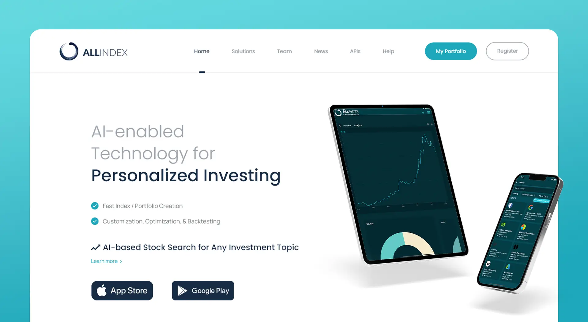
The introduction of the vibrant teal color directly taken from the investing portal created a cohesive visual link between the website and the product by not only adding a refreshing, approachable feel, but also contributed to a visually captivating interface. A significant focus on adopting a more user-centric approach was evident in the transformation of ‘Login / Register’ into a more inviting ‘My Portfolio’ prompt, promoting a sense of personalization.
Incorporating animations strategically, we aimed to highlight the seamless functionality of the product and guide users intuitively. These animations not only showcased the product in action but also fostered a deeper engagement with the technology.
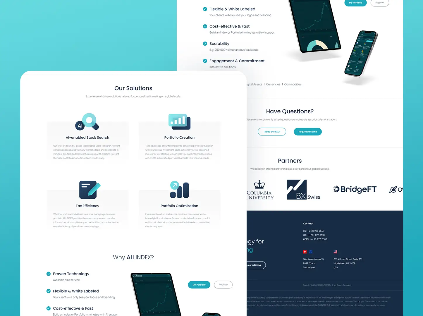
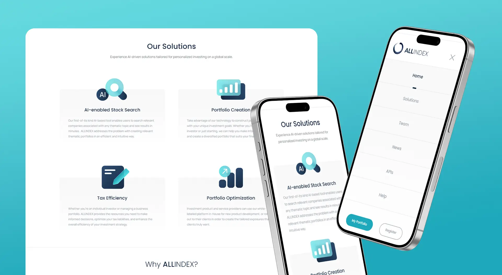
Additionally, a deliberate approach to white space was implemented to ensure a clean, uncluttered user interface. This purposeful utilization of ample white space emphasized the product’s simplicity and user-friendliness, creating a visually soothing and efficient overall experience for users.
Furthermore, each section was enriched with concise sentences, ensuring clarity and facilitating seamless and intuitive navigation throughout the website.

